Max Batt
Currently design director at Hangar, is a designer, educator, and advocate specializing in the design of new technologies.
currently
design
director,
hangar
Max is currently design director for Hangar, a New York-based venture studio that creates tech. companies for public sector solutions.
At Hangar, Max has led the design of breakthrough technology products, from AI wildfire prediction to special government projects.
As design director, Max facilitates design work that helps founders, investors, and policy stakeholders explore early-stage ideas, primarily related to emerging intelligent technologies.
Design Direction (UX, UI), Product Design (UX, UI)
In 2019, Hangar launched a project from the Rocky Mountain Research Station focused on rapid wildfire predictions.
Hangar’s data scientists focused specifically on the development of Suppression Difficulty Index, which used cutting-edge research to express various fire potentials.
As the technology began to formalize, questions around practicality began to surface. How would users in the field use this? And which fire responders and planners, specifically, were the best users?
It was reliant upon user research to clarify the unique needs — and broader world — of the end users: wildfire responders.
User Research
Through extensive primary research, a clearer picture emerged:
Hangar led several phases of user interview and analysis sprints with a diverse array of end users, including federal and state wildfire responders, behavior analysts, and policy makers.
These efforts were supported by the prestigious federal Small Business Innovation Research grant — also known as America’s Seed Fund. Taken together, this lead to a number of key findings:
USER CONTEXT
Active Burn vs. Prescribed Burn
Users expressed that the analytical needs of ‘active incidents’ differed greatly from those of ‘prescribed burns,’ leading to an initial product focus of prescribed burns.
USER NEED
“Easy” Interface
All users said they had limited ‘available attention’ to dedicate to digital tools. They valued a simple UI and also stressed they preferred an “easy” web application over a downloadable desktop app.
DESIGN PRINCIPLE
Highlight Customization
Users valued and trusted their own (local) data more than centralized (federal) data. For this reason, we prominently highlighted data customization features throughout.
Design Exploration
Refining comprehension through color and perception.
Hangar worked closely with the users and the data scientists to propose, evaluate and select a color schema visualized the data in a way that was both empirically accurate and visually comprehensible.
Mapping experimental data in 3D.
Early on, it was unclear what the final prediction calculations might look like, but we needed to see *something* to plan the product. For discovery, we ran several speculative design experiments that vizualied how the outputs might exist in different environments.
Final Application
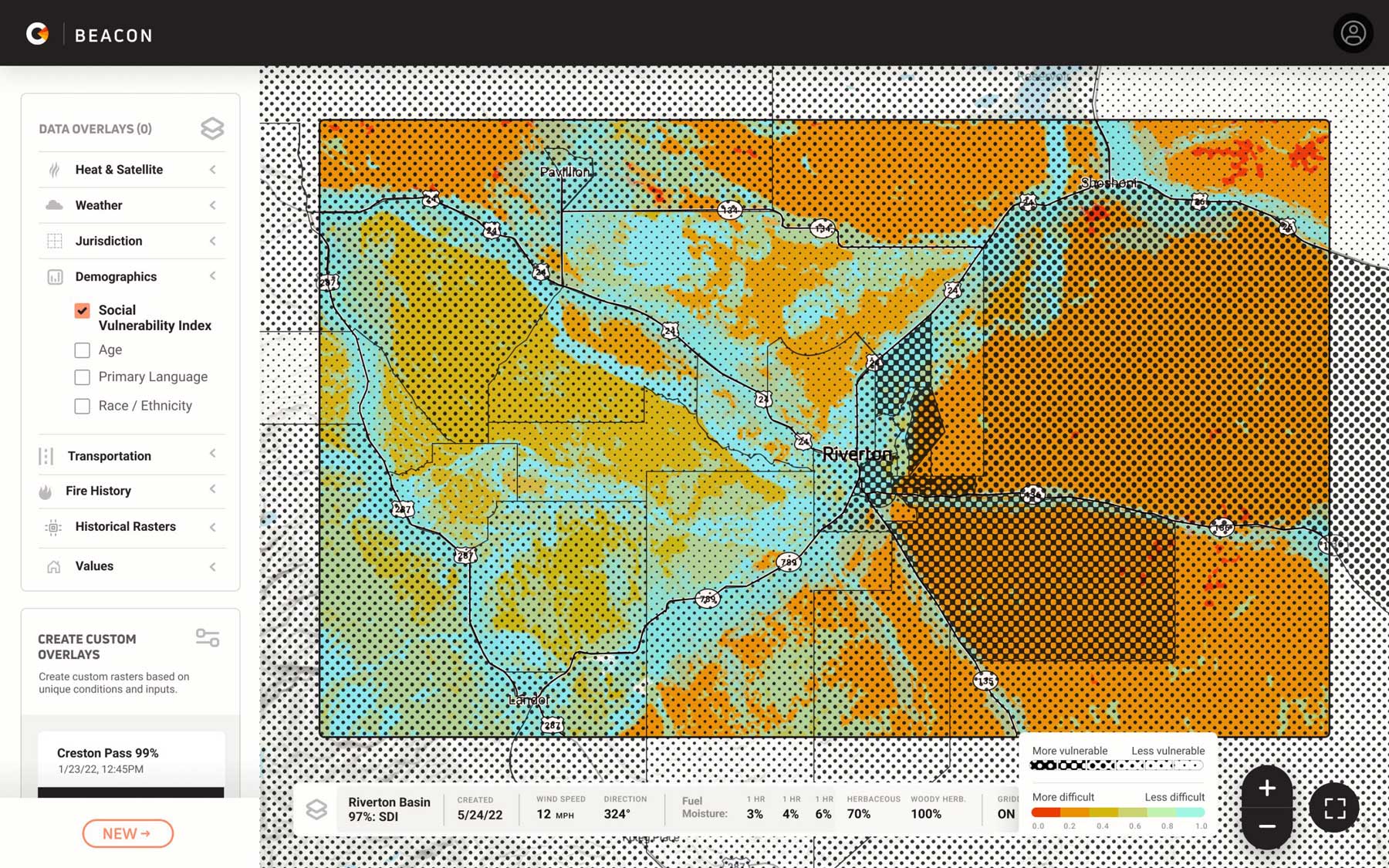
Blending known data with predictive data.
The final app blended known contextual data — ie demographic & environmental data — along with new predictive data, which represented various potentials for fire behavior. This blending of known and predictive data provided the context that users indicated they needed to best use the computations generated by the app.
Press & Accolades


Cornea Eyes in on Fire Using Better Data
Tech Crunch


Cornea Wins SBIR Innovation Grant
Small Business Innovation & Research Program
Design Direction, Product Management, Product Design
Meter was created to make federal data more usable via AI.
Federal contracting databases have grown bloated, dispersed, and stale. This creates challenges for both federal agencies and U.S. businesses.
A large portion of the U.S. economy involves “contracting” between governments and businesses. Yet the federal procurement processes — while thorough — remain cumbersome due to the underdeveloped tools connected to various important federal databases.
In 2019, Hangar began working with federal agencies on an initiative that sought to help modernize government contracting.
Initially, many process questions surrounded the product mandate. Further, our clients required that our application be usable across all federal agencies.
Hangar needed to understand what users needed in an intelligent contracting application, and design an interface that would satisfy not one, but many disparate federal agencies.
User Research
A government-wide discovery, seeking universal procurement truths.
Meter’s initial product research unfolded in two broad phases and ultimately reached fourteen different federal agencies.
The first phase focused on defining market research, which was used for foundational product experience work.
The second phase focused more practically on how users perform marked research, and captured the more explicit user needs and expectations.
We ultimately interviewed, prototyped, and validated accross:


DHS
DEPARTMENT OF HOMELAND SECURITY


NASA
National Aeronautic and Space Administration


HHS
U.S. Department of Health and Human Services


USAID
U.S. Agency for International Development


GSA
General Services Administration


STATE
U.S. Department of State


FWS
U.S. Fish and Wildlife Service


DOC
U.S. DEPARTMENT OF COMMERCE


ED
Department of Education


NRC
Nuclear Regulatory Committee


VA
U.S. Agency for International Development


FS
U.S. Forest Service
Interview rounds led to several key findings and insights, including:
User CONTEXT
No Time to Read
When users described their time constraints, many plainly said they didn’t have time to “read text,” only to “look.” This context drove a number of key design decisions.
USER Need
All the Databases
Users said the product wouldn’t be practically usable unless it included *all* databases in one single app. In turn, we added several new information types not originally specified.
DESIGN PRINCIPLE
Beyond Incumbents
Users believed that federal contracts are too often awarded to the same existing vendors, so we designed our tools to make it easy locate the ‘upstarts’ that have less experience, but equal relevancy.
Design Iterations
Visualizing vendor performance.
Because users indicated they preferred most of the information visualized in some form, we put extra effort into data viz. exploration. Sharing these design studies directly with users helped us ensure the prominent visualizations made sense to everyone.
Pattern mode for color-blind and low-vision users.
Accessibility was a foremost concern, and we wanted to ensure the extensive data visualizations shown throughout were accessible to low-vision and color blind users. As a solution, we created a pattern system that was baked into all performance visualizations, for those who needed it.
Final Application
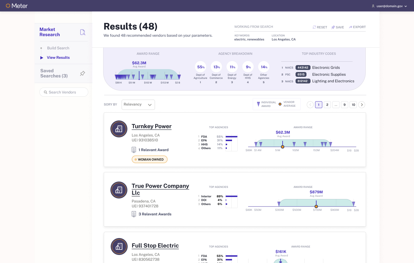
Hyper relevant procurement information, at a glance.
The final product creates a shortlist of vendors based on the contract requirements input by the user. The process uses advanced data science techniques to pull in the most relevant information, and then presents it back to the user through a clean interface that highlights only the information needed for procurement purposes.
Press & Accolades


Can AI make better sense of past performance data?
Washington Technology


Awardees advance for Artificial Intelligence prototype initiative
G2 Exchange
Concept Design, Service Design, Product Design
At Hangar, Max has led the design of conceptual and speculative proposals for government bodies.
Hangar has worked with a number of government entities on disclosed early-stage initiatives. By design, most of this was never developed, but much of did have a meaningful impact on the long-term development of policy and governmental integrations of new technologies.
FOR
Small Cities
Large Cities
State Governments
Federal Agencies
Committees & Offices
WE HAVE
Designed speculative services
Designed for unenacted policies
Designed for sensitive data
Designed for emergencies
is a
designer
Max has led the design of some of the industry’s most interesting, transformative and impactful projects.
From renowned design studios to R&D labs, Max has deep experience leading the design of bleeding-edge and next-generation products.
Max’s consumer work began Hot Studio, which was founded by design luminary Maria Guidice. Maria often reminded the studio that “users are people,” and it was her real human-centered guidance that powered much of Max’s initial enthusiasm for product design.
Later, Max joined the early-stage startup TuneIn Radio, where he had the once-in-a-lifetime privilege of working alongside Google Ventures, including within the now-legendary GV Design Sprint. Max’s work at TuneIn Radio helped grow the startup to over 80 million listeners and capture a number of awards, including Editor’s Choice for both Apple App Store and Google Play.
Max has since worked with and for some of the industry’s most exciting design agencies, and increasingly within research labs and stealth technology orgs. This move upstream has allowed Max to explore how design can more directly support technologies at — and even before — their formation.
Art Direction, Design Direction, Product Design
MXX began at Queen Mary University with the research of the philosopher and scientist, Dr. Joseph Lyske.
Dr. Lyske’s work lead to the discovery of a sound-based genetic algorithm, which allowed machines to understand music at its most fundamental, “atomic” level.
Soon after the technology’s graduation, Max began working with a small team of product experts from the United States convened by David Summers, one of the industry’s most esteemed and clairvoyant product design strategists.
The initial raw technology demonstrations were unbelievable: the prototype could seamlessly rearrange a given song at will, in a way that sounded extremely well-edited.
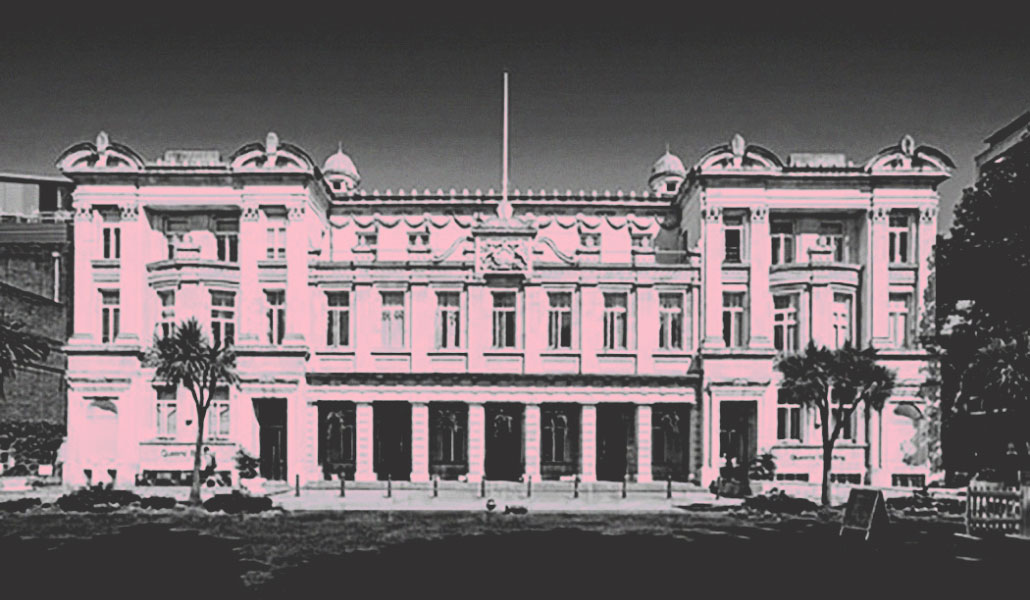
Queen Mary University
At the same time, there were growing questions as to how this technology could be practically used. Internally, several ideas were floated: as a standalone music-based social network, as a creative tool for making quasi-original music, or perhaps as a promotional tool for record labels and music video releases.
What was a compelling use case for the technology, and was there a version that could be used by consumers, or acquired by a larger business?
PRODUCT DISCOVERY
Max traveled to London to help facilitate a gathering of scientists, musicians, and capitalists in search of a market fit.
Through a series of focused discovery exercises, a picture began to emerge of a basic scoring application that would rewrite music to synchronize with user-provided video content. With this, the target user become more clear: producers and sound engineers.
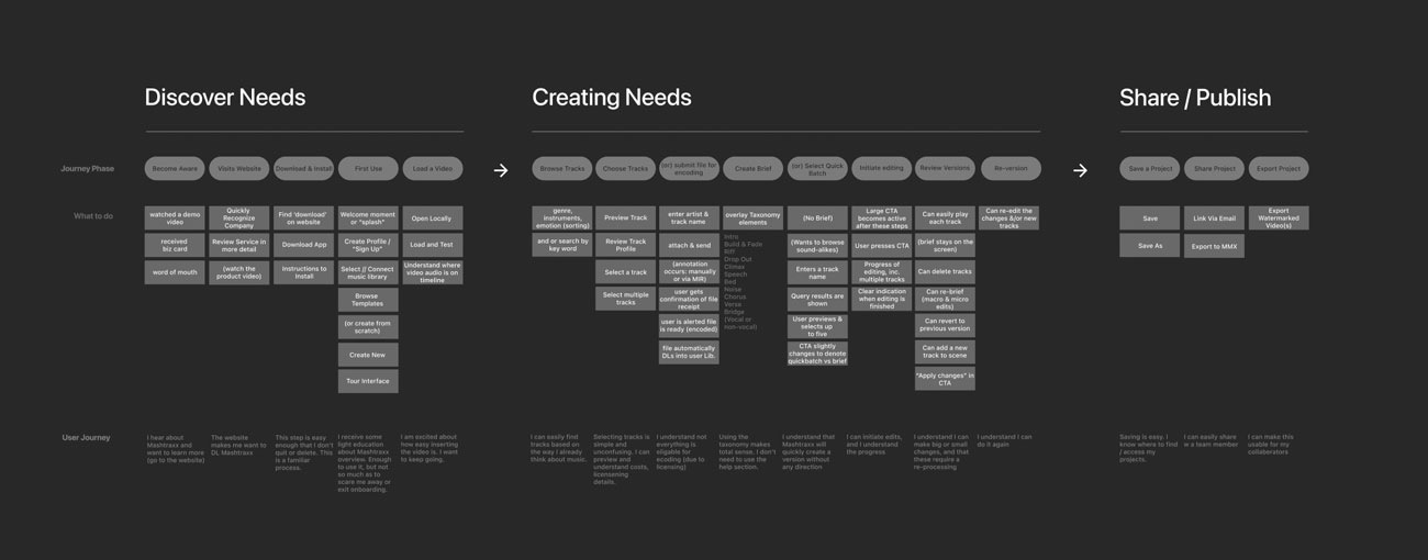
Visual Research
Defining the visual appearance of musical commands
Since the interface needed to focus on the “atomic” musical commands, the team decided to begin by exploring the visual forms they could take. These graphic expressions needed to capture the essence of the musical reference, using the purest visual form possible.
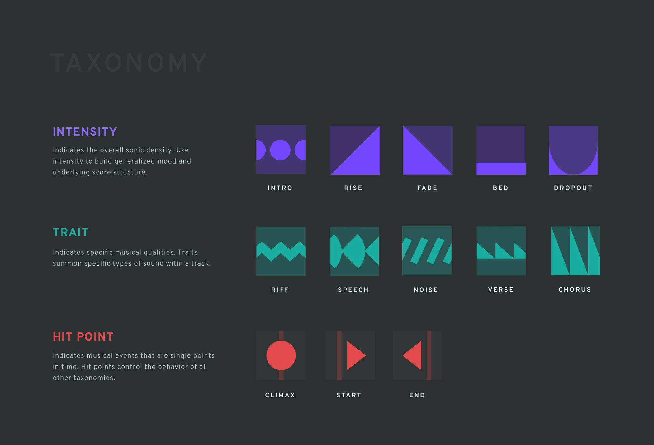
Designing a visual taxonomy of musical commands
Max worked with Dr. Lyske and team to establish a sonic glossary of musical commands that could be used to represent any number of musical scores, regardless of real-world specifics such as music genre, track length, video type, etc. These abstract musical “taxonomies” underscored all of the future application that would follow.
Introducing The Creative Brief
A visual method for capturing the sprit of the music desired for scoring. It is used to seamlessly align music to key moments in video content.

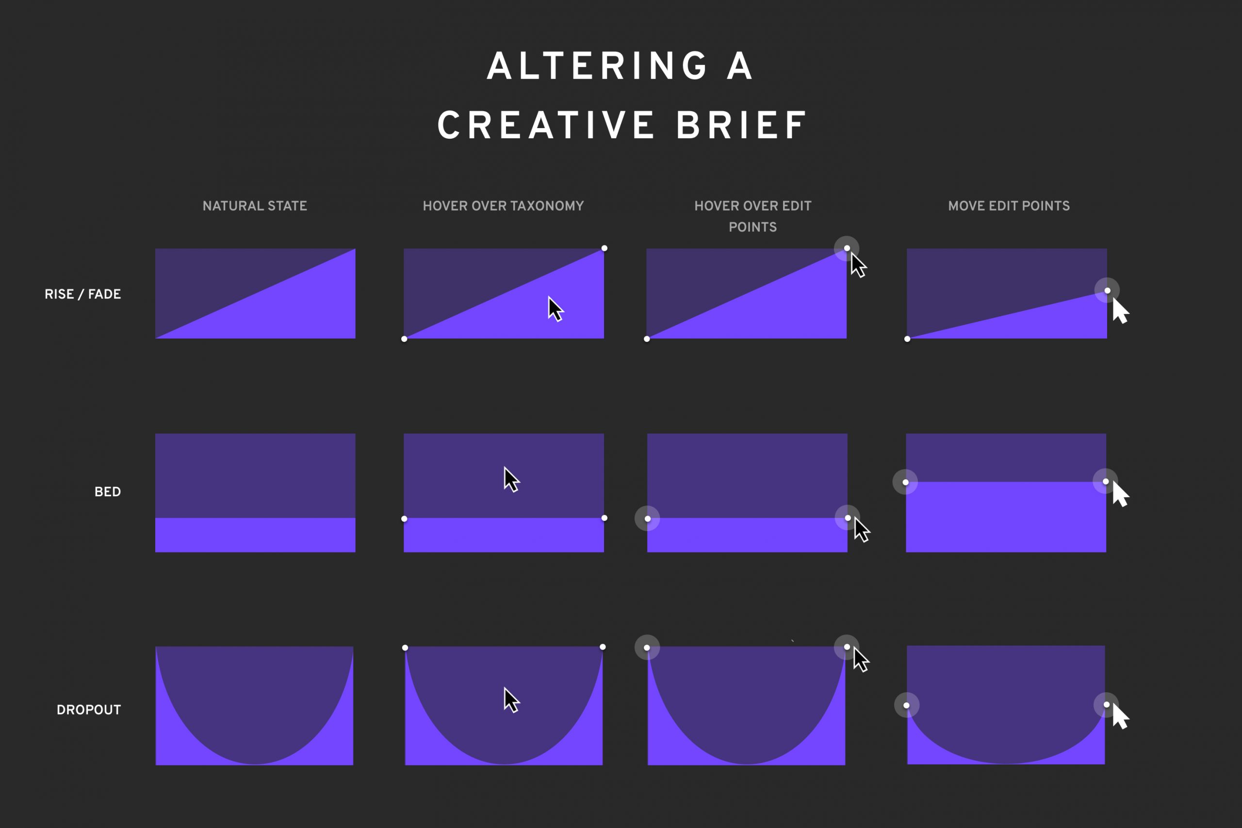
The music taxonomies naturally led to a simple drag-and-drop interface.
Once Max and team had established the baseline taxonomies that could be used to fashion creative briefs, they quickly arrived at a simple drag-and-drop interface. In initial user testing, the interface was extremely well-received.
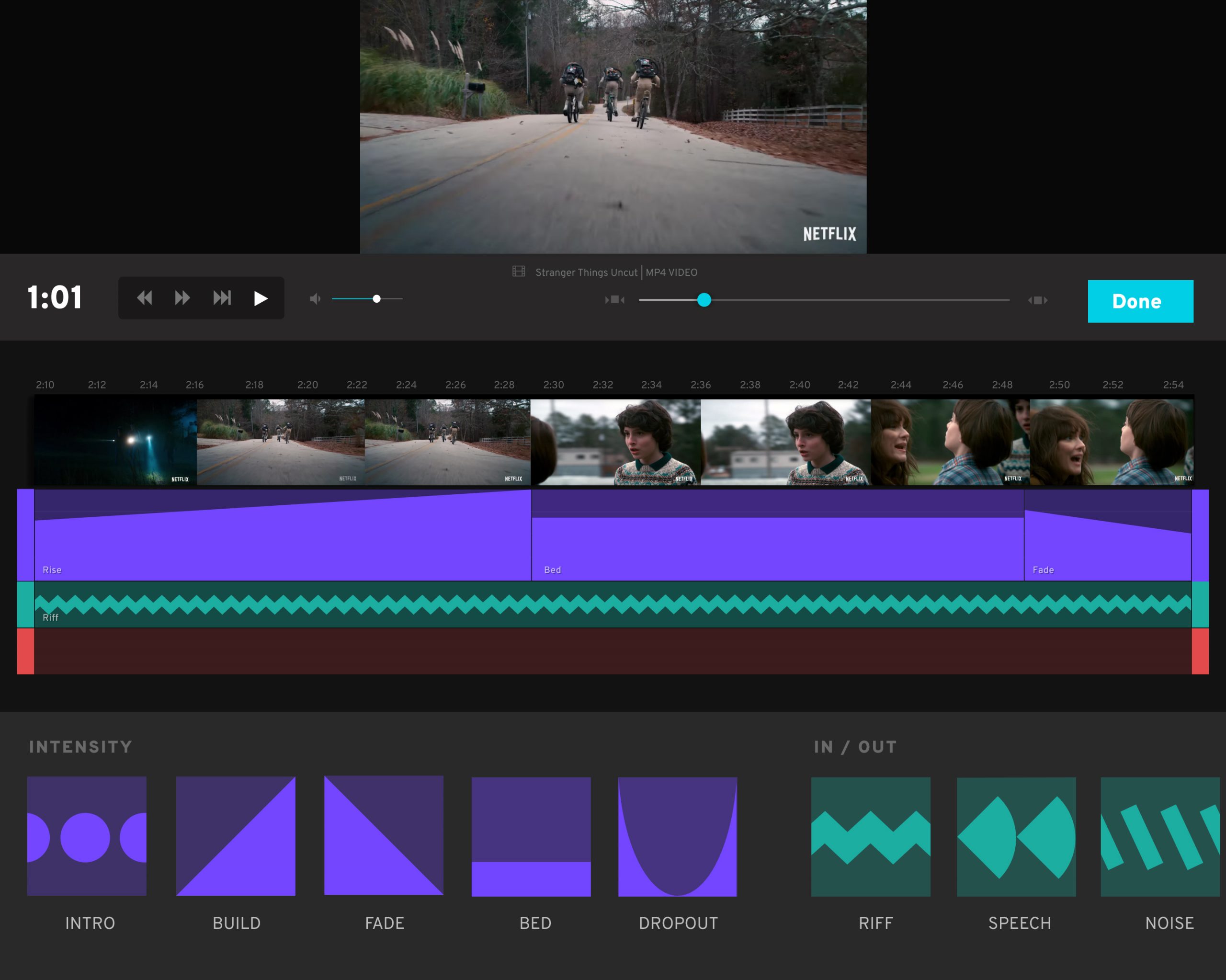
‘Stranger Things’ footage & IP is owned by Netflix Productions, LLC
Backend AI Interface
Additionally, this required the creation of a backend interface used to tune the AI itself:
The backend allowed musicians to teach the AI how to interpret the music it used for scoring.
Crucial to this internal interface was the ability to quickly locate “ins” and “outs” that could act as gateways to different parts of the song.

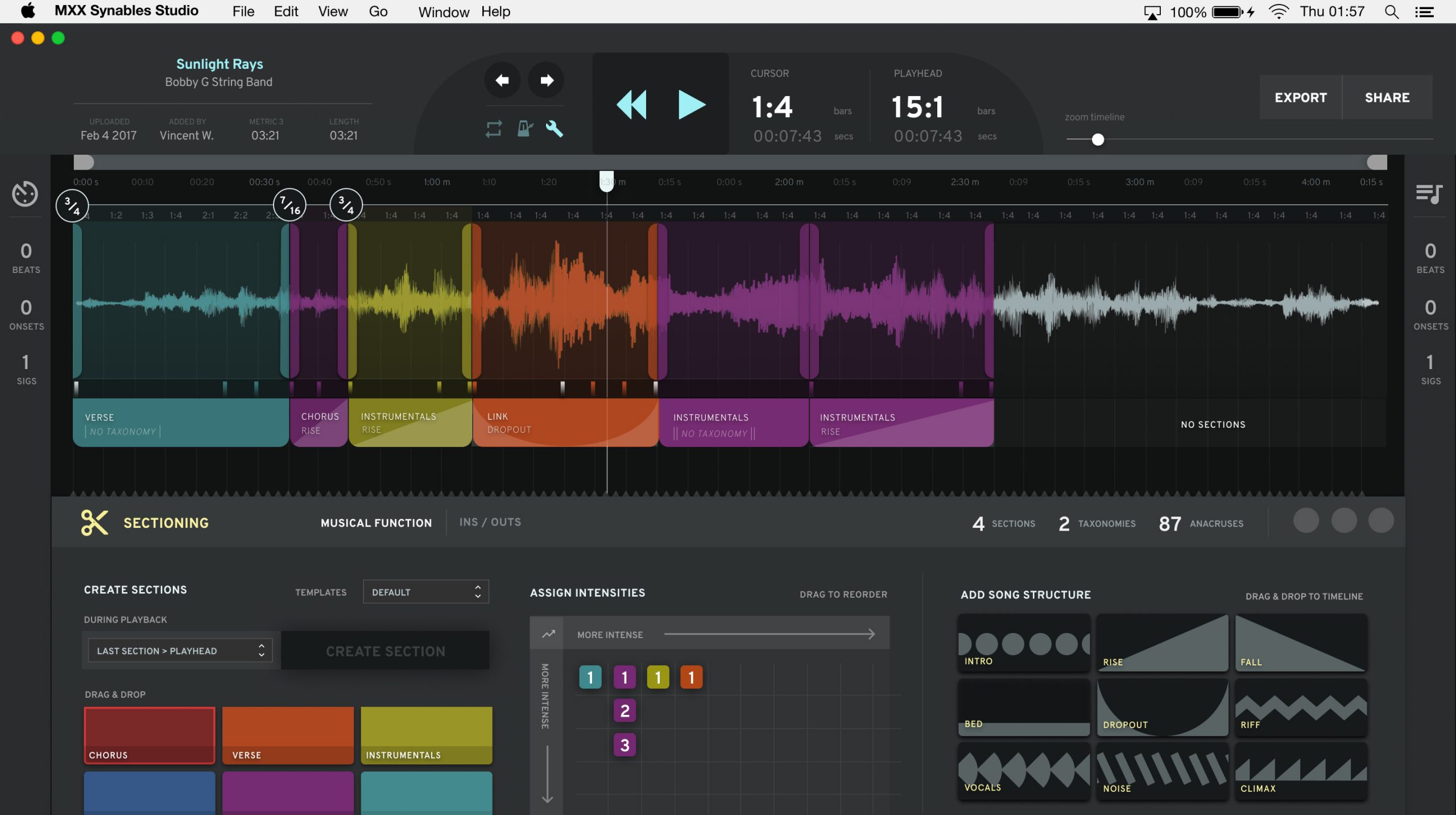
Helping the AI learn through responsible listening.
Through paid professional “annotators,” MXX fed the first songs through the AI with manual and extremely detailed human guidance, using the backend interface designed by Max and team. Additionally, the AI was run using professional music legally owned through a partnership with Epidemic Records. These two decisions were made in order to advance this breakthrough technology without infringing upon the legal or moral creative rights of musicians.
FINAL INTERFACE
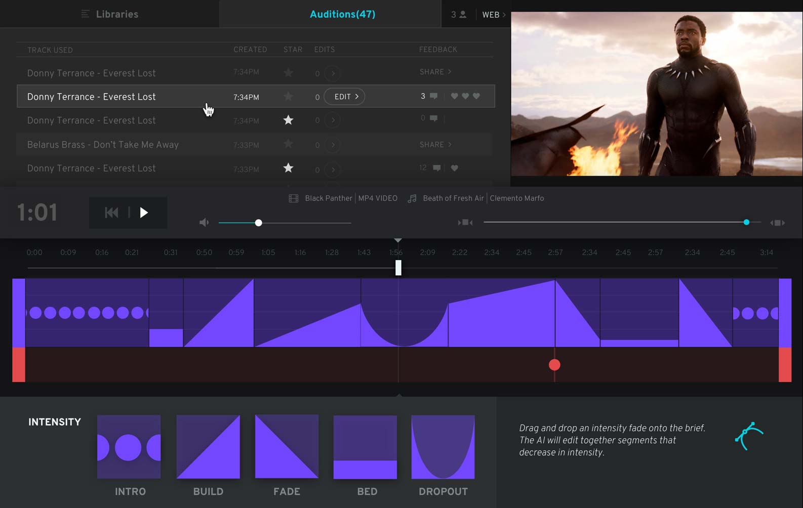
‘Black Panther’ footage & IP is owned by Marvel Studios, LLC
Watch the unbelievable product demonstration.
Kong: Skull Island movie trailer, instantly re-scored to a classic country western song.
‘Kong: Skull Island’ footage & IP is owned by Legendary Productions, LLC
Press & Accolades


Winner: 1st Place
2019 Artificial Intelligence Awards


Robot rhythms: the startups using AI to shake up the music business
The Guardian UK


MXX Acquired by Triller in $10 Million Investment Round
The Wrap
Concept Design, Service Design
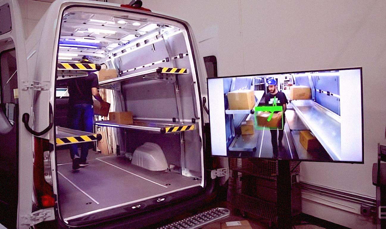
Image courtesy Endgadget.
How Mercedes vans learned to see their cargo.
And how design pitched the technology before it really happened.
Mercedes Benz operates multiple R&D “shops” — many situated in and around Silicon Valley, CA — focused on specific technologies and objectives. For years, its Cargo Recognition and Organization System (CoROS) team had been researching ways of bypassing manual hand-held package scanners.
The benefits of automatic package recognition were clear on both the human impact and business case fronts: delivery drivers and associates could avoid repeated physical movements that were shown to contribute to serious physical ailments and job dissatisfaction. Meanwhile, fleet operators like FedEx, UPS and others could load and deliver their cargo faster, which contributed to substantial financial savings.
Eventually, their ambitious computer vision technology began to work, and they brought in Max as product consultant to help define — and ultimately sell — this technology to Mercedes HQ.
R&D Design Strategy
What was the best design approach to illustrate what was possible?
Max and team carefully considered a number of design formats, including interface design, software prototyping, and hyper-realistic hardware simulations.
They eventually decided that illustrative was the best way to show what wasn’t yet fully realized, while also allowing viewers’ own imaginations to play a part in the realization of the vision.
DESIGN PRINCIPLE
Show the World
The computer vision technology, though impressive, had mostly been seen and shown in lab environments only. The team concluded that the video needed to show the technology within a multi-scene world environment that underscored the breadth of its potential use.
SELECTED FILM CLIPS
Max cannot share the disclosed images of the technology itself, but these selected clips show the overall design approach taken for Mercedes R&D.
Showing large operations over time
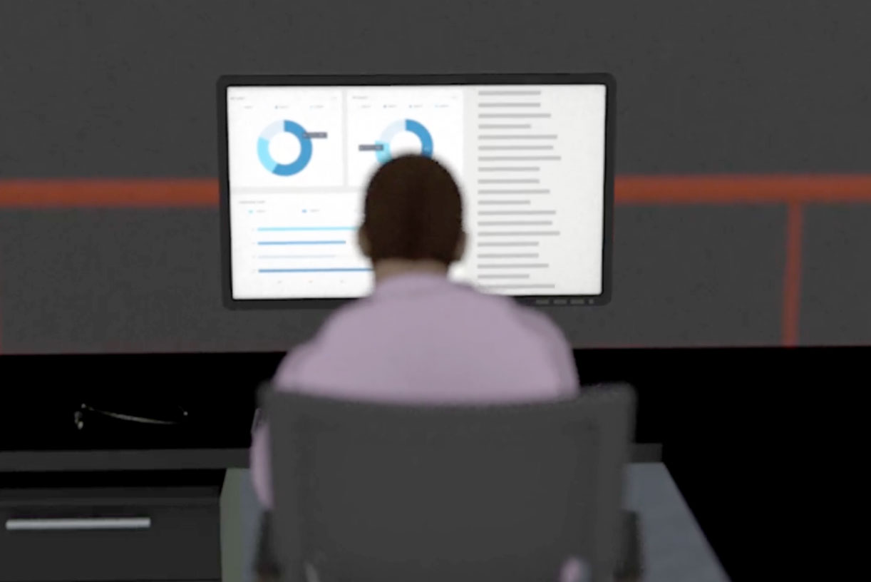
Many of the ideas generated by the R&D teams required the depiction of large-scale, time-intensive processes that would have been difficult to stage with live video or through software interface suggestion. For this reason, Max introduced a number of key timelapse scenes, shown in 3D animation, that clearly and quickly communicated how large processes work over time.
An aspirational take on research & development
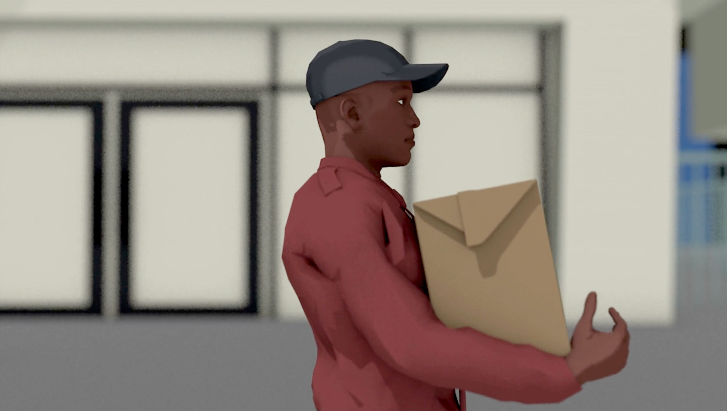
Beyond simply explaining the technology, the team wanted to inspire and excite the stakeholders. Early on, we made a strategic decision to use beautifully rendered, captivating, and alluring imagery in to ensure this vision of the future was not only believable, but also appealing.
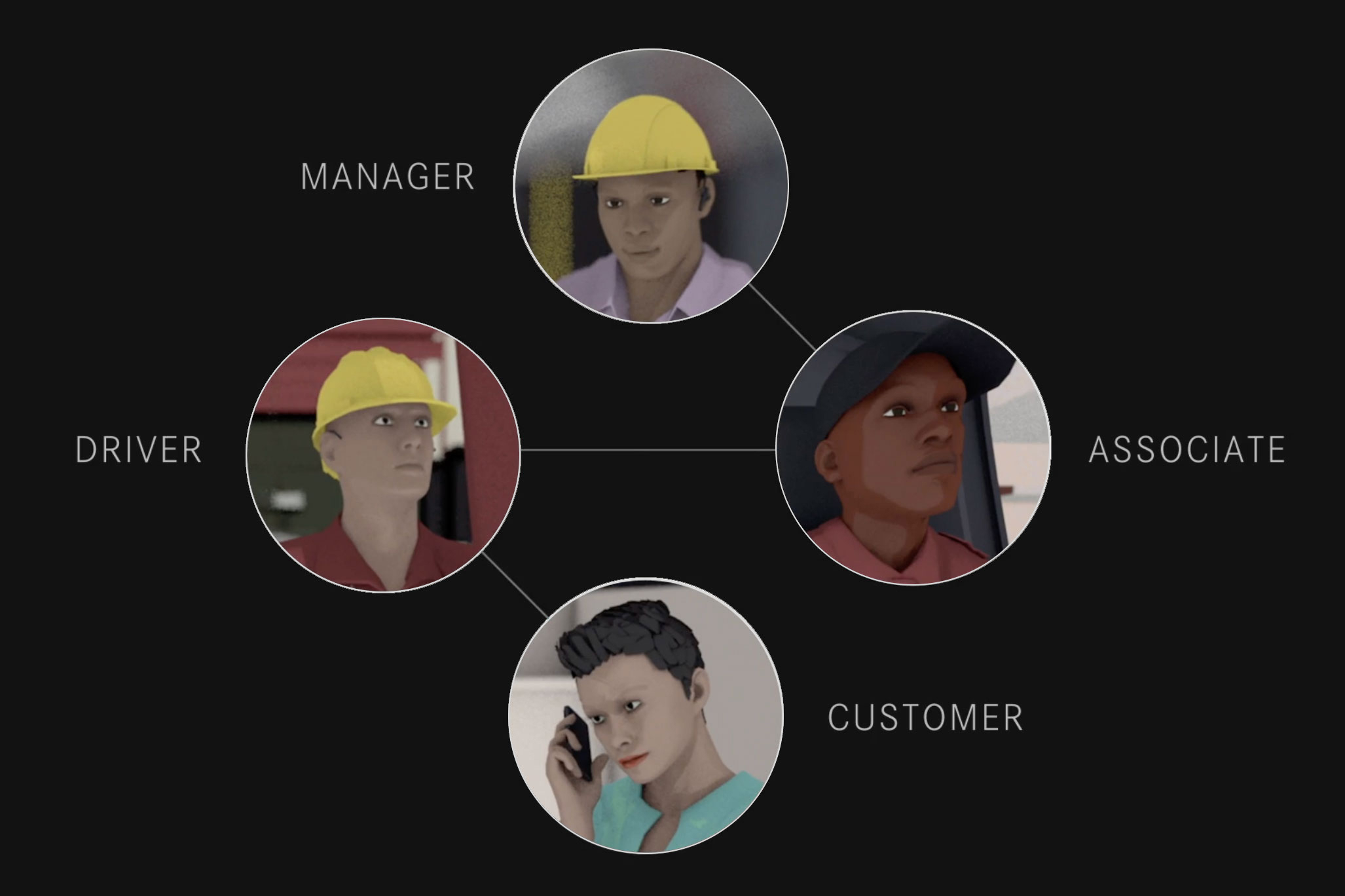
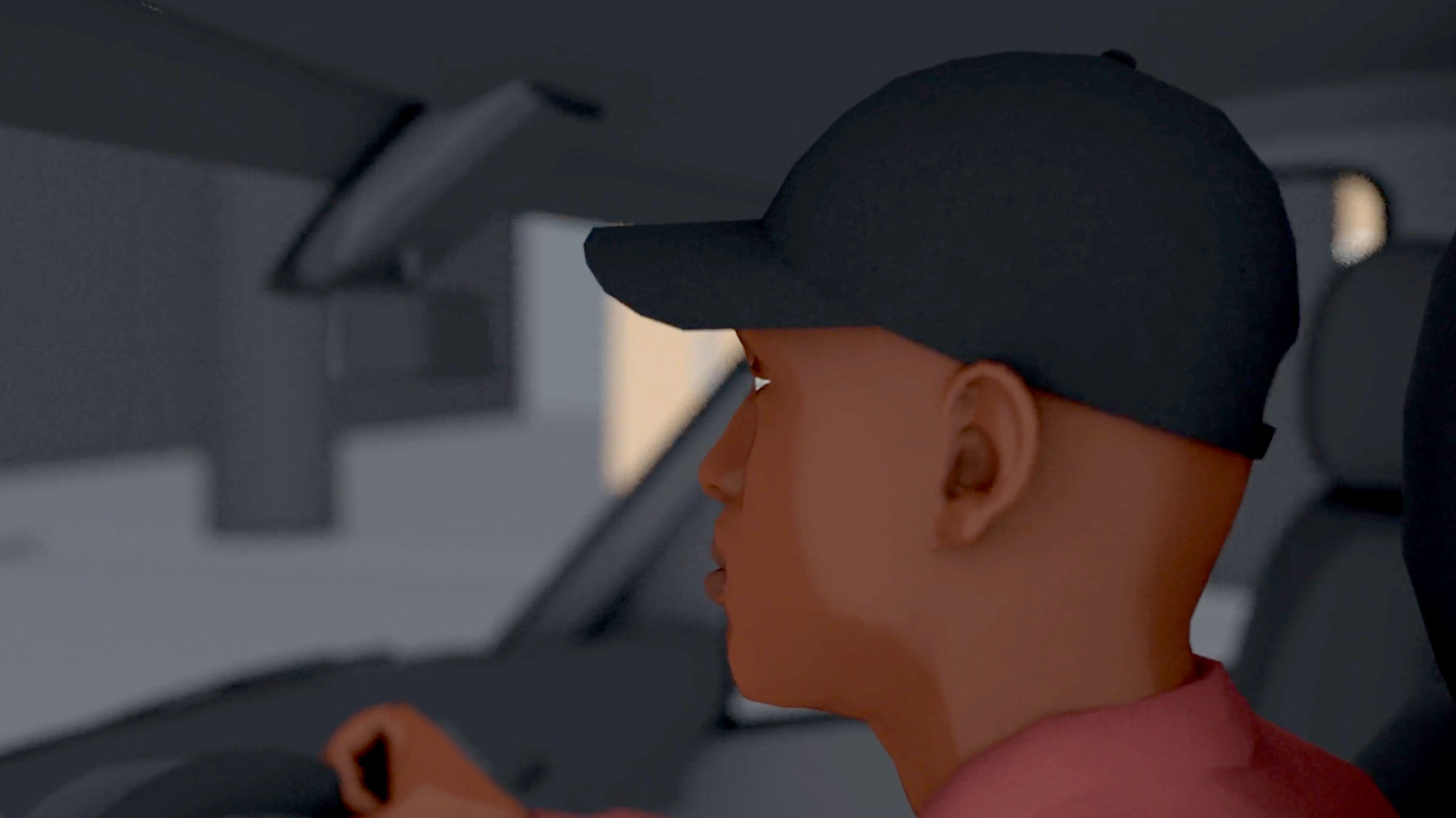
Use of human characters
The environments we designing for involved complex, multi-domain systems that ultimately served very different types of end users, secondary users, and individual stakeholders. Using discrete characters allowed us to tell a product story that included natural and compelling human perspectives.
PRODUCTION
The project was greenlit for production, and then spun out as its own company.
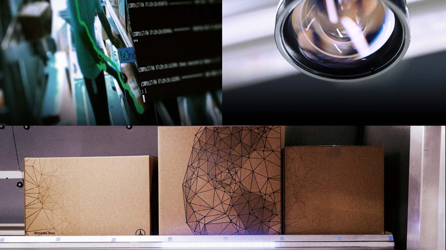
COROS images courtesy Mercedes Benz.
Press & Accolades
UI Design Lead
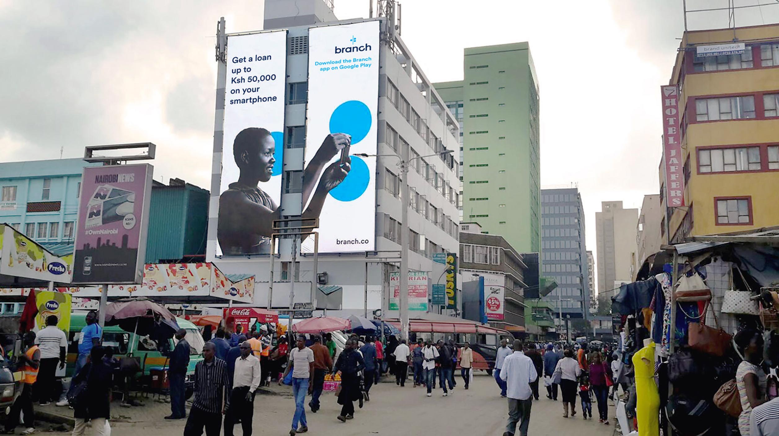
Brand direction by Ty Whittington.
A bright idea from the founders of Kiva: loans without banks.
In underbanked countries, citizens lack access to bank accounts, and small business loans are hard or impossible to come by.
This means that everyday small business owners and merchants often have no access to credit that can keep businesses afloat, enable growth opportunities, and ultimately help lift communities out of poverty.
Matthew Flannery, creator of Kiva, had been working on a new mobile technology that sought to enable small loans through a user’s cell phone, even for users with no bank account. The provocative technology referenced a potential borrower’s non-financial information such as a Facebook account, or other known human contacts, to verify the their identity and instantly underwrite a small loan to their virtual wallet.
The new venture, Branch, had already established an office in Nairobi and had a created working prototype of their technology.
Max collaborated with the world class talent at Ammunition to learn more about the problem and begin crafting a universal design solution.
PRODUCT DISCOVERY
Kenyan users described their working environment, which led directly to key design constraints.
With this project more than any other, Max’s experience as a consumer designer in California could not substitute for the experiences of his end users: merchants and business owners in Eastern Africa.
Max and team did not physically travel to Kenya, so there were known limitations to the breadth of the overall research they performed. Max remains proud of the Branch project, and also fully acknowledges his own privileges and agrees with emerging criticisms on universal design thinking that excludes the real-world perspectives of end users, which he tried to avoid.
Ultimately, the team at Ammunition did have the chance to virtually meet with both proxy representatives and also multiple end users through Branch’s office in Nairobi. These users offered additional context that painted a unique experience picture.
Most notably, many users did not actually have access to Internet where they lived, and would only sporadically access Internet through physical visits to public WiFi hotspots.
This fundamental difference in Internet availability required a different experience approach, and the team began pushing for a “phase-based” user journey that would treat time as a relative construct based on loan milestones, rather than an absolute construct tied to a real-world loan clock.
These findings began to coalesce into key design and experience takeaways:
Design Constraint
No Guaranteed Internet
Because users didn’t have guaranteed access to Internet, the team couldn’t use a design approach that relied on timely or constant status deliveries. Instead, an approach of relative time based on loan milestones was chosen.
USER Need
“What’s Next?”
Users said their primary concern was advanced knowledge of the “next” milestone, deadline, or payment with their current loan, with everything else being vastly less important. This heavily influenced the final interface design.
DESIGN PRINCIPLE
One Action per Screen
Because we were designing for extremely small Android phones with very small screens, and because users said they mainly cared about their next loan milestone, we opted to always include one single action per screen.
FINAL PRODUCT
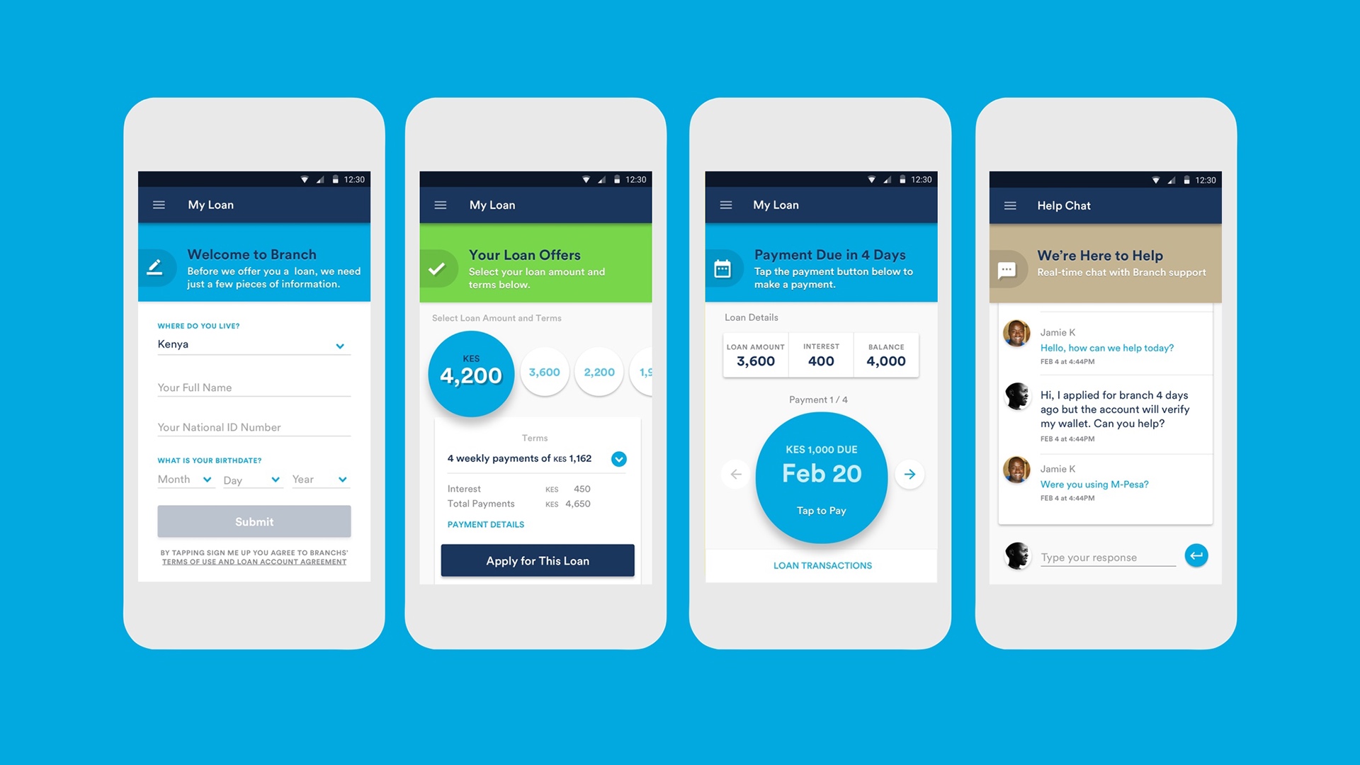
A snappy and dynamic mobile app, delivered in extremely low kilobytes.
The team relied nearly 100% on design assets that shipped with the Android operating system, so in the end the app was extremely small in download size, and also easy to render on older phones.
The icons used were part of Google Material design system, as were the typefaces. Other than a few pieces of Branch branding, the app used elements that were already installed on users’ phones.
One action per screen.
Each screen presented one message to the user, and one corresponding action. The interaction approach was incredibly simple, but effective for what was needed.
RECEPTION
With its formal release, Branch quickly became a smash hit.
Branch first launched in Kenya and Tanzania, and quickly became a smash hit with users, jumping into the Top 5 Most Dowloaded Apps on Google Play in several African countries.
Even today — years later — Branch remains a top finance app in Kenya, Nigeria, and India: a testament to its enduring popularity. But more importantly, it has helped enable a new wave of real-world economic development in the places it’s needed most.
Press & Accolades


4 UI Lessons For Underserved Markets
Fast Company


Winner: AI Excellence Award,
African Fintech Summit
Punch Magazine
Additional Projects
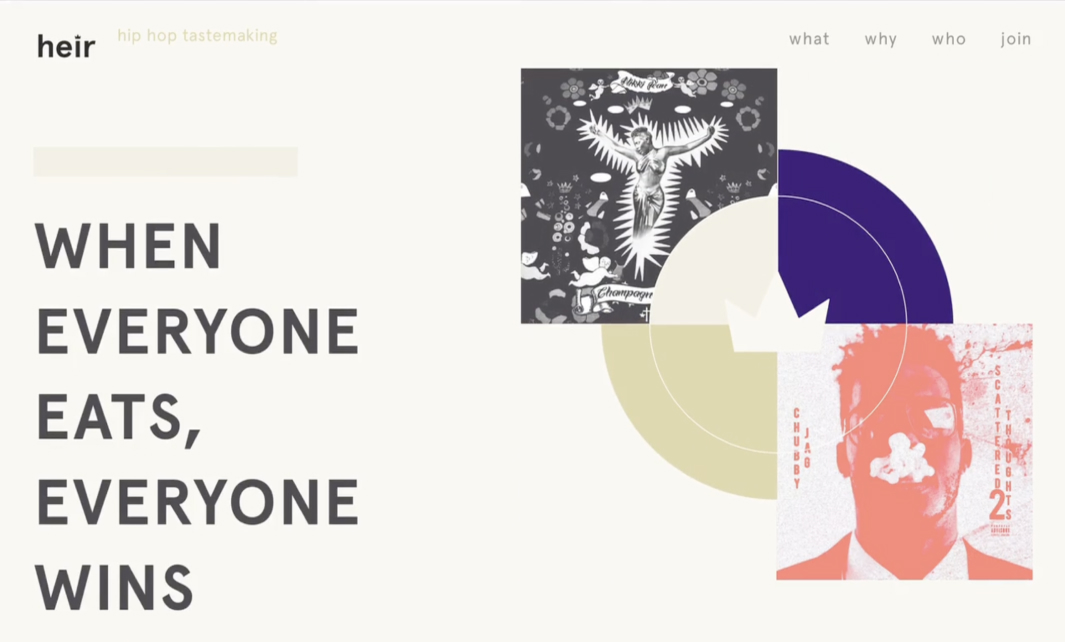
Heir
A radically new music platform from hip hop superstar Pusha T


OPEN
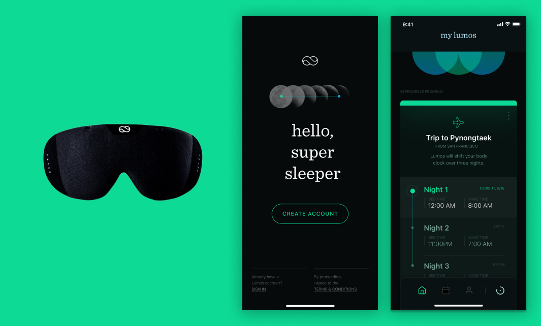
Lumos
A stunningly beautiful interface for a breakthrough sleep technology.
Coming Soon
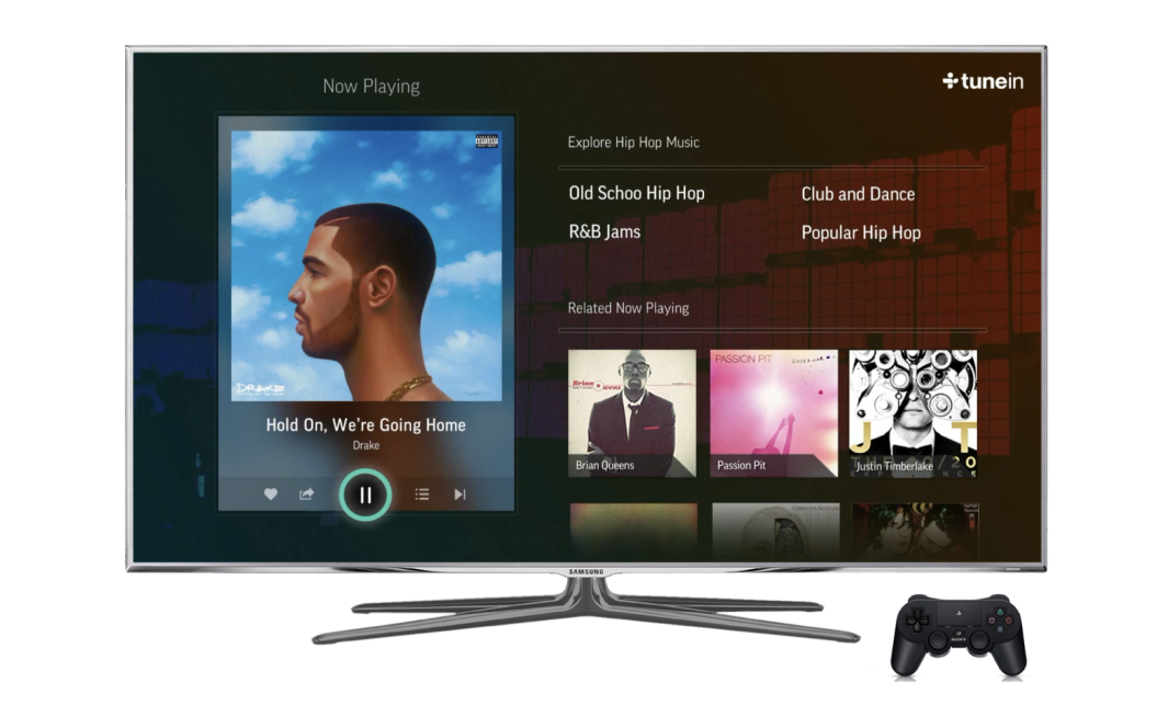
TuneIn
Award-winning consumer design for over 80 million listeners.
Coming Soon
Westfield Labs
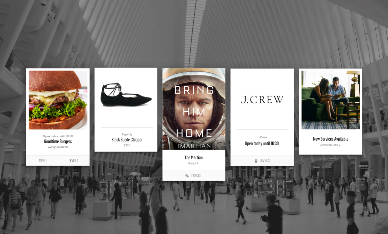
Systems design for massive commercial spaces.
Coming Soon
Heir
Head of Design


In 2017, Max joined the founding team of a new, fan-based music platform.
The company, heir, was created by technology innovator Summer Watson and hip hop superstar Pusha T, and focused on fan empowerment through attention-based transactions.
Scouting down original hip hop artwork
Authenticity was one of heir’s core brand values, so we knew early on that we needed real hip hop album artwork our brand collateral. Max meticulously scouted and personally contacted dozens of independent hip hop artists in order to procure a fantastic collection of album artwork for the website and other brand touch-points.
MOBILE APPLICATION
A stunner of a mobile app that rallies around fan taste.
The mobile app laid the foundations fan-based economy that would empower and connect artists with fans.
Fans could use the app to “vote” on a song, casting their critical opinion into a crowd consensus that not only highlighted new and interesting artists, but also laid down the initial architecture for a decentralized game economy.
This ambitious project sought to shift the power dynamic away from the centralized and fixed institutions of record labels, and towards the fan and artist.
Mixing elements of music, gameplay, and networking:
Press & Accolades


Pusha T Launches New Hip Hop App
Hype Beast


Here’s What Pusha-T’s New Hip-Hop App Is All About
Complex


Pusha T Launches Hip-Hop App ‘Heir’
Billboard
educator
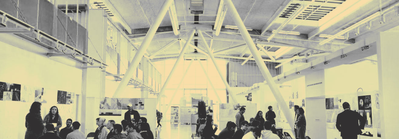
Since 2017, Max has taught design at the California College of the Arts in San Francisco.
CCA is one of the nation’s premier design institutions, and emphasizes design education through theory and practice.
This mixture of academic rigor with industry and technical innovation has made CCA one of the most energetic and exciting venues in the design world, particularly through the various partnerships it maintains throughout The San Francisco Bay Area.
CCA students come from all over the world, bringing a diverse array of cultural backgrounds, creative and intellectual perspectives, and unique talents. The result is a one-of-a-kind, deeply invigorating studio culture that creatively interrogates the values and ideas of today, expands the bounds of design exploration, and integrates technical innovations in meaningful and impactful ways. Max is honored to work with such dedicated, talented, and imaginative students.
Adjunct Professor
Bringing industry into the studio
As adjunct professor, Max’s teaching approach — and authority — come from the expertise he brings from industry. His practical experience outside of academia helps direct his teaching in a way that adds context and meaning to what can be a rigorous and challenging academic front, especially on the technical side, where many design students, for various reasons, are naturally disinclined to learn more.
Courses Taught
Studio Forward
Sponsored Studio, Google, MFA Design
Teaching speculative design
Co-taught with Cristina Graitán, an interdisciplinary MFA studio that uses speculative design to propose radically futures through music and sound. Sponsored by Google and culminating with a physical exhibition at the world-renowned YBCA in Spring ’23.
Motion Graphics
Advanced Studio, BFA Graphic Design
Teaching modern motion graphics
Advanced studio elective teaching motion graphics to visual designers. Curriculum includes classic animation principles and references, with additional emphasis on motion graphics through storytelling and spatial / 3D design.
Interactive Design
Core Studio, BFA Graphic Design
Teaching design through code
This course teaches visual designers how to code, primarily for web, and how to create meaningful design work that takes full advantage of the unique affordances within digital environments, while also growing students’ formal and conceptual design skills.
AND
advocate
Max has led a number of civic design organizations and efforts focused on expanding the reach and impact of design at large.
Through design collaborations with dedicated non-profits and NGOs, to design-based programming and events, to design access initiatives, Max has worked to apply design in a number of important ways outside of the market.
This idea of work outside the market underpins the definition of advocacy that Max uses for his own work. To be a design visionary is to believe the world can improve through the reach and impact of design. To be a design advocate is to put some form of work towards that vision.
Max has learned and worked alongside some of the industry’s most inspirational design advocates, and looks forward to a continued lifetime of service to society through design.
AIGA SF
Interactive Chair, 2015-2018
AIGA is the professional organization for design, and the San Francisco chapter is one of the most active and influential.
As Interactive Chair, Max managed a team of experts that designed, launched and managed the chapter’s digital properties, as well as contributing subject matter expertise towards major strategic, programming, and outreach and partnership efforts.
Under the executive direction of Dawn Zidonis, Max, alongside other industry experts, contributed their respective design experience and prowess towards a collective goal of further empowering of professional designers.
ACCOMPLISHMENTS
INCLUDE
Established AIGA Interactive Committee
Chapter Website Redesign & Rebuild
Launched new Digital Ticketing
Misc. Events & Fundraising
Highlight
Compostmodern Festival
Opening titles for an urgent sustainability conference.
Compostmodern was a design sustainability conference produced by AIGA, and their 2013 theme was “resilience.”
The conference was to convene San Francisco’s venerated Palace of the Fine Arts in San Francisco, and the festival’s producers and AIGA and Hot Studio wanted a provocative motion graphics piece to introduce the festival and brand they’d created.
More broadly, they wanted to highlight the festival’s central ideas around resilience: that systems needed persist across longer lifecycles and take inspiration from the design of our natural world.
Max worked diligently to produce a motion graphics piece that would juxtapose local dilapidated industry and wastelands alongside the hopeful and resilient imagery of nature.
The piece opened the festival, and was later admitted into the 2013 Cannes Film Festival’s Short Film Corner.
Festival identity by
Perin Ramba.
Aerial piloting by
Gilles Roux
Music by
Birds & Batteries
San Francisco Design Week
Interactive Chair, 2016 – 2018
SFDW is one of the nation’s largest and most influential design festivals.
As Interactive Chair, Max produced the festival’s digital properties and helped manage programming for the interactive, interaction, and technical events.
Max worked with a small team of incredibly vibrant and enthusiastic industry advocates with a diverse array of backgrounds including interaction design, industrial design, and graphic design.
As interactive liaison to SFDW leadership, Max helped locate, onboard and shepherd a number of important industry partners, which helped contribute to a large increase in festival size and attendance over the years of Max’s participation.
ACCOMPLISHMENTS
INCLUDE
SFDW Website Redesign & Launch
Synchronized Online Ticketing
Digital Onboarding Redesign
Event Production & Management
Highlight
SFDW 2017, Pier 29
Big Talk: An interactive exhibit on election angst
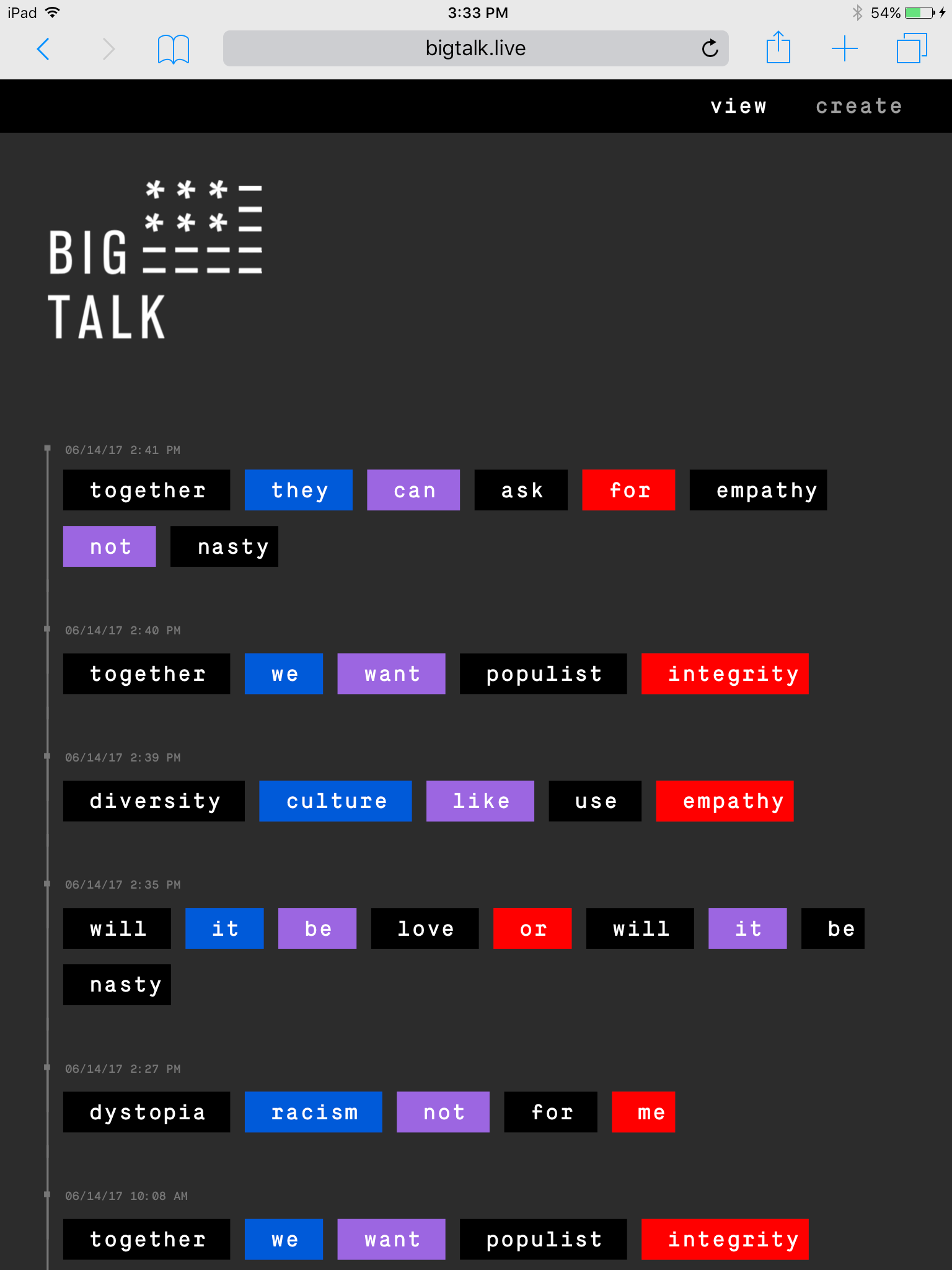
Big Talk was an interactive exhibit that came together under Max’s direction over the course of months in response to the cultural angst the nation was feeling in the wake of the radical political change and subsequent polarization of 2016 and 2017.
The exhibit allowed visitors to rearrange keywords on a magnetic wall during the Opening Reception as a “live expression,” of their hopes, fears, and responses to the socio-political environment.
The intent was facilitate and capture the”talk” in a way that was both expressive, but also by design, unifying.
Exhibition identity by
Micaela Brookman.
Computer vision script by
Andre Rand.
Live Web Transcription
A clever python-based computer vision script enabled the live transcription of the phrases created at the event onto the accompanying website.
For the Community
Max works directly with non-profits, organizations, and institutions to help them achieve their goals.
Max has worked with a number of local non-profit institutions, festivals, and groups that are dedicated to the enrichment of society through design, art and technology.
INCLUDING:
Human Rights Data Analysis Group
SF Museum of Modern Art
Common Crawl Internet Corpus
SF Short Film Festival
SPECIALIZING IN
design
FOR
new technologies
Why Max looks forward to new technologies.
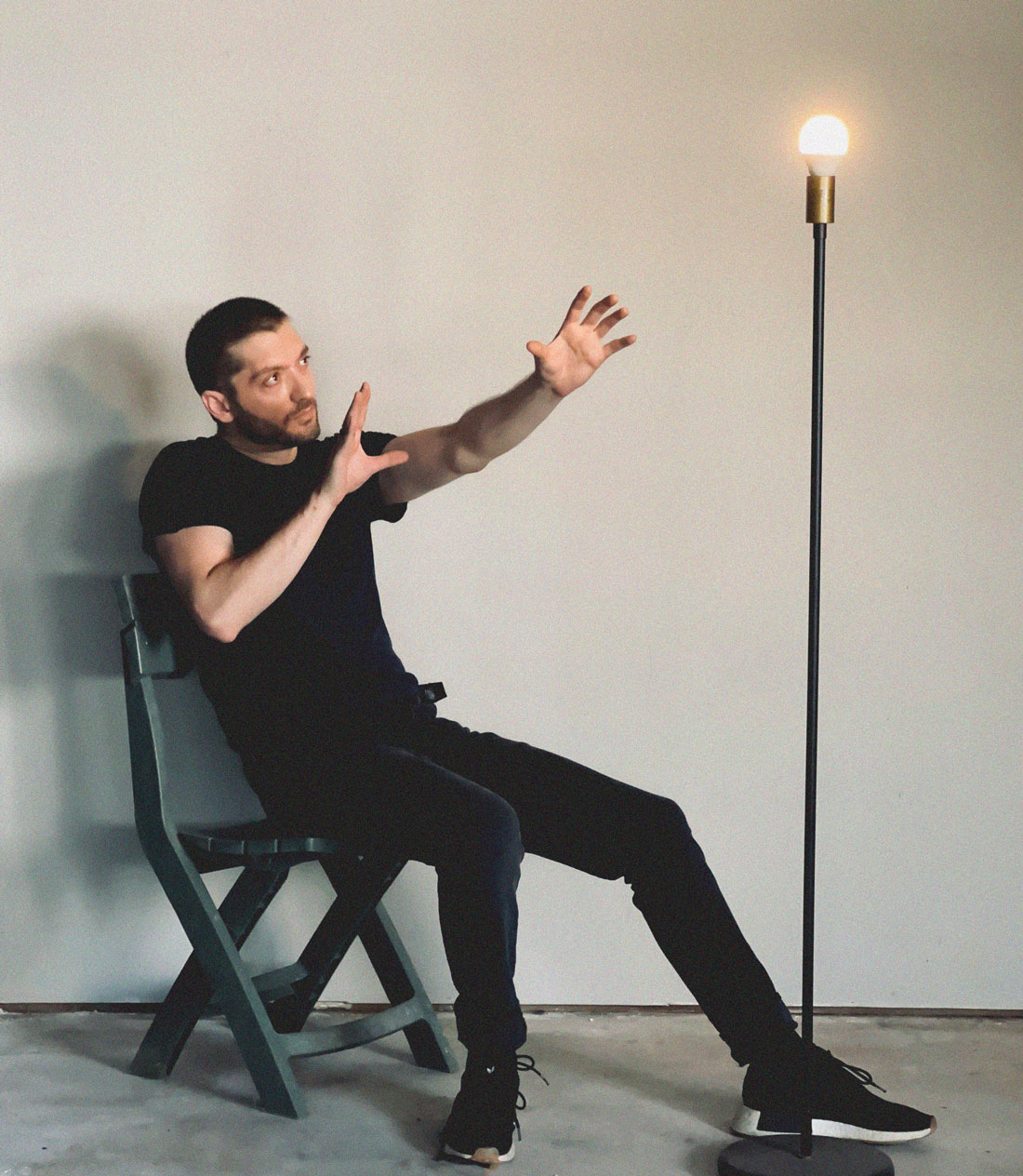
Max is a critical optimist who approaches new technologies with a fantastical enthusiasm for the unknown, coupled with a responsibility towards what we do know about our world, and ourselves.
He finds that new innovations in science and industry, especially those just being formed or even not yet formed, are the amongst most impactful, important, and interesting spaces in which designers can work.
Max has increasingly worked in these spaces, and it is here more than anywhere that he believes in the power of design to propose and realize a better future.
thank you for visiting
Follow Max
COPYRIGHT 2022
All Rights Reserved.
Materials shown on maxbatt.com are owned by Max Batt, other individuals, and other organizations and are protected by copyright. The reproduction, re-use, and/or distribution of these materials is expressly prohibited.
Copyright also prohibits the use of materials from maxbatt.com for the machine reading, “training,” and/or other use of other methods intended to influence the generative production of design outputs by software and/or artificial intelligence.
View privacy policy for maxbatt.com.